Homepage / Bullion News & Charts Archives: Quarterly Precious Metals Charts & News

ExpressGoldCash - 4.9 star - Customer Reviews
Updated on 01/20/2026
Quarterly Precious Metals
Charts & News
In any market, most investors want to know as much as possible about an investment before deciding to get in or out of it.
This guide has been posting news on its homepage since 2011. The quarterly pages listed below contain archives of the news collected over the years, providing insight into how precious metals have moved in the market and the reasons behind those movements.
Directly below the quarterly links, you will find definitions and descriptions of technical indicators investors use on charts to help them decide the direction of their investments money.
Quarterly Precious Metals
Charts & News
|
2025 2024 2023 2022 2021 2020 2019 |
2018 2017 2016 2015 2014 2013 1st Quarter - 2013
2012 1st Quarter - 2012
2011 |

BGASC - Customer Reviews - 4.8 stars
Candlestick Charts
Candlestick charts display the opening, high, low, and closing for an asset's price.
Candlesticks can be measured in minutes, hours, days, weeks, months, years, etc.

The graphic to the right is a diagram of how to read each area of a positive or negative candlestick.
The wide part of the candlestick is called the "real body."
The top and bottom of each candlestick indicate the opening or closing price, depending on whether it was a negative or positive movement that day.
The extended line above or under each candlestick is called the "shadow."
Shadows show the priced items high and low.
Candlestick shapes, influenced by price movement, vary in size and can provide insight into future price trends.
Moving Averages
Moving averages are trend lines that indicate the average price movement. by a certain number of days or a set amount of time.
In the gold price chart below, the 50MA moves closer in relation to the price of gold than the 200MA; the shorter the time period of the moving average, the closer it will be to the asset price.

When the lines move on the chart cross, they form either a Death Cross or a Golden Cross.
To Learn More about Moving Averages, Go to this StockCharts.com page Simple and Exponential Moving Averages.

SD Bullion - 4.8 star Customer Reviews
Golden Cross / Death Cross
When Moving averages cross, technical analysts call these actions a Golden Cross or a Death Cross.
A Golden Cross is a bullish indicator, it happens when a Shorter Moving Average (50MA) crosses over and above a Longer Moving Average (200MA).
Whereas a Death Cross is a bearish indicator, it happens when a shorter moving average (50MA) crosses below a longer moving average (200MA).

RSI - Relative Strength Index
The Relative Strength Index is an easy indicator to use when trying to forecast price action.
The RSI is a technical momentum indicator that compares recent gains to recent losses in an attempt to determine the overbought and oversold conditions of an investment.
As you can see from the chart above, when the RSI indicator goes above 70, the price of the investment is overbought, and when the RSI is below 30, the price of an investment is oversold.

MACD -
Moving Average Convergence/Divergence
Oscillator
MACD is pronounced just as it looks, "Mac-D."
The MACD (black line) is calculated by subtracting the 26-day EMA.(exponential moving average) from the 12-day EMA.

The red line, called the "signal line," is a 9-day EMA, functioning as a signal to buy or sell.

The MACD histogram represents the difference between the MACD black line and the red signal line.
The MACD histogram starts from the "center-line," known as the "zero line."
")
When the histogram is above the zero line, it shows a buy signal, and when it is below the zero line, it indicates a sell signal.
To learn more about the MACD and how to read its moving averages, go to the StockCharts.com page defining MACD: Moving Average Convergence/Divergence Oscillator.
ExpressGoldCash - 4.9 star - Customer Reviews
Trend-lines -
Support & Resistance Price Levels
A trend line is a straight line that connects two or more price points.
Trend Lines are an easy tool to use to identify the price movement on a chart.

To Learn More about Trend Lines - Go to this StockCharts.com page defining: Trend Lines
Support Price Levels
Support Price Levels develop after a price has tested a level more than once, then bounced back above it each time it happened.
As you can see in the Gold price chart below, from mid-2010 through the first quarter of 2013, the price of gold repeatedly touched the $1,525.00 price level, then moved upward each time it happened; after this action occurred more than once, this action in price created a Support Price Level.

ExpressGoldCash - 4.9 star - Customer Reviews
Resistance Price Levels
Price charts create Resistance Price Levels when support price levels break.
In the chart below for the 2nd quarter of 2013, the price of gold collapsed under its support level of $1525, making this level a Resistance Price Level for Gold.
Likewise, in the chart, you can see the resistance level confirmed when Gold's price tried to come back up to the level but was unable to break its new Resistance Price Level.

When gold's price broke back above the $1525.00 level; this level again became a support price level.
To Learn More about Trend Lines: Go to this StockCharts.com page defining Trend Lines.
ExpressGoldCash - 4.9 star - Customer Reviews
Other pages, on this Guide, that you
may like...
|
|

|


Quarterly Precious Metals Charts & News
For Bullion Market News...
Notice:
The charts, commentary, and information on the Free-Bullion-Investment-Guide.com are in no way an endorsement of how you should invest or divest.
|
Support this Guide & Paypal Thank You for Your Support |
|
|
 | |||||

Recent Articles
-
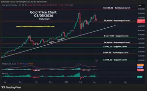
Newsletter of the Free Bullion Investment Guide - May 2026
May 05, 26 02:25 PM
 The May 2026 newsletter of the Free Bullion Investment Guide provides the latest updates, fundamental and technical gold and silver market analysis, the best articles from last month, and a list of re…
 -
Newsletter of the Free Bullion Investment Guide - April 2026
Apr 05, 26 04:44 PM
 The April 2026 newsletter of the Free Bullion Investment Guide provides the latest updates, fundamental and technical gold and silver market analysis, the best articles from last month, and a list of…
 -
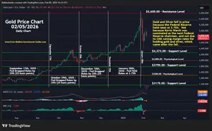
Newsletter of the Free Bullion Investment Guide - March 2026
Mar 04, 26 02:08 PM
 The March 2026 newsletter of the Free Bullion Investment Guide provides the latest updates, fundamental and technical gold and silver market analysis, the best articles from last month, and a list of…
 -
Newsletter of the Free Bullion Investment Guide - February 2026
Feb 07, 26 02:12 PM
 The February 2026 newsletter of the Free Bullion Investment Guide provides the latest updates, fundamental and technical gold and silver market analysis, the best articles from last month, and a list…
 -
Newsletter of the Free Bullion Investment Guide - January 2026
Jan 07, 26 04:07 PM
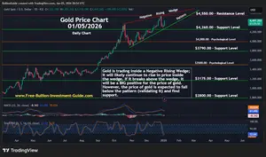 The January 2026 newsletter of the Free Bullion Investment Guide provides the latest updates, fundamental and technical gold and silver market analysis, the best articles from last month, and a list o…

18W LED Security Light (Dusk to Dawn & Motion Sensor) - $32.99
from:
 LED Lighting

) (as of March 11, 2011)")
This website is best viewed on a desktop computer.
Keep this Guide Online
& Paypal
Thank You for
Your Support
with Feedly
Search the Guide
| search engine by freefind | advanced |
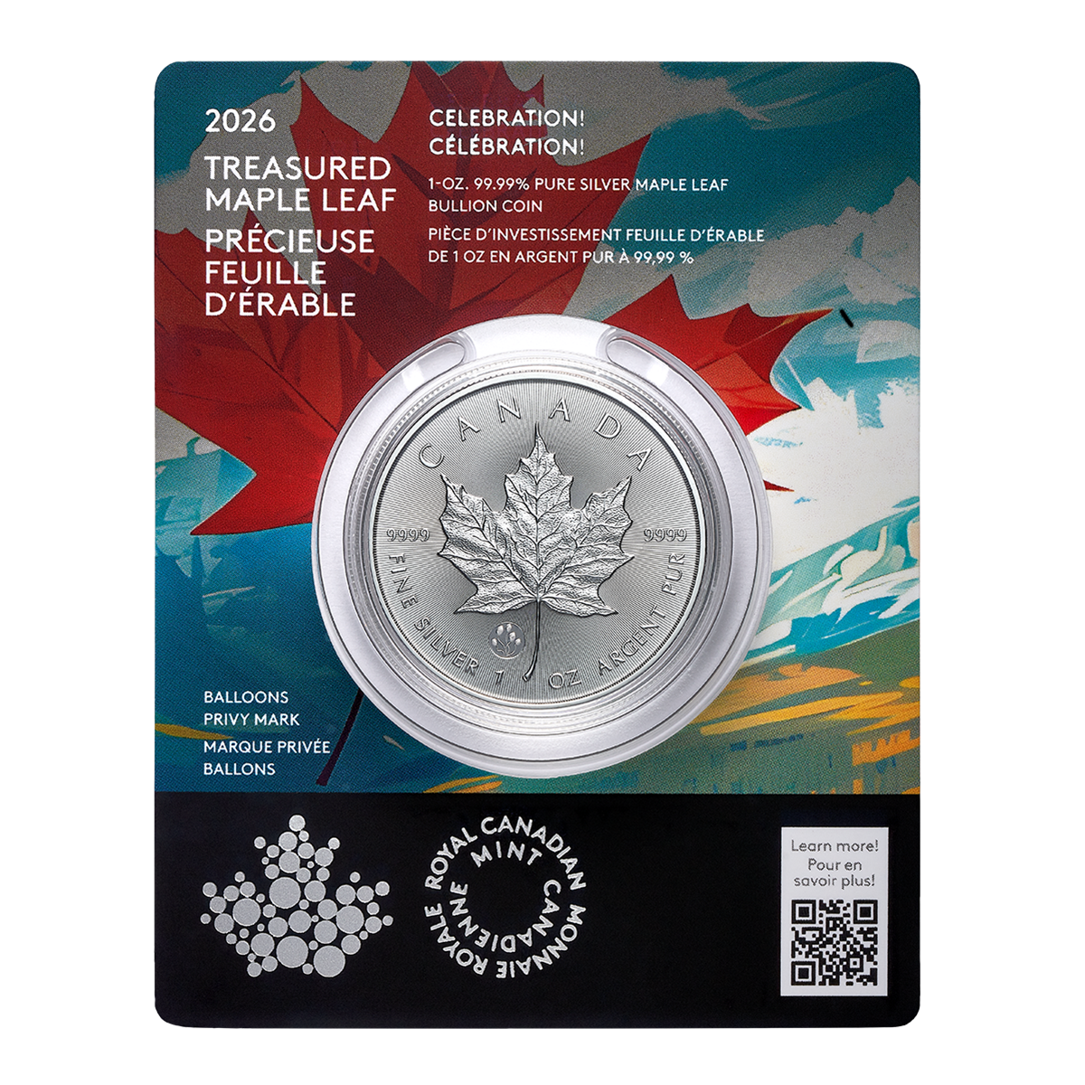
Give a lasting gift of the iconic Silver Maple Leaf bullion coin [More]
Free Shipping on Orders over $100 (CDN/USA)
The Sovereign 2026 Gold Bullion Coin in Card
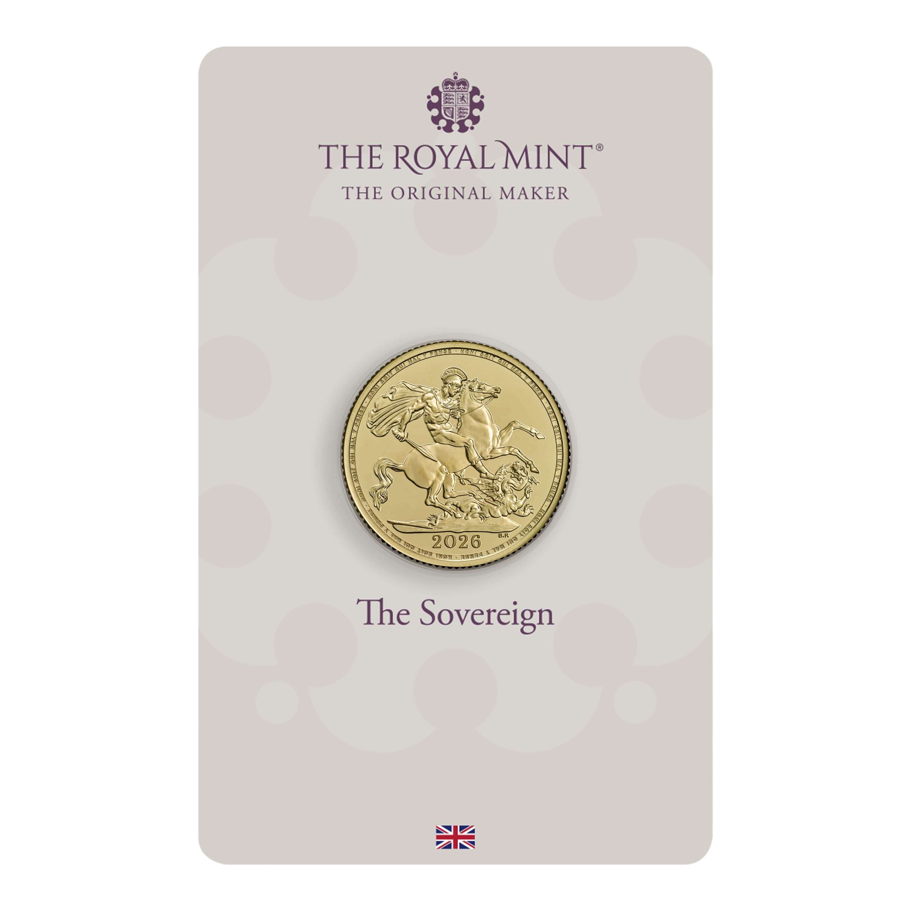
Britian's
Royal Mint

Daily
2026 Silver Kookaburra
Photo & Mintage Update

Newsletter
Mintages & Photos
|

|
Silver Panda |

Mintages
for
2024
Gold, Silver, & Platinum
Austrian Philharmonic Bullion Coins

|
Silver Philharmonics  |
Platinum Philharmonics

Platinum and Palladium Bullion


Mintages
for
2025
Gold & Silver Mexican Libertad
|
Gold Libertads |


Updated Mintages for
American Gold Buffalo
American Gold Eagle
American Silver Eagle


Help Us Expand our Audience by forwarding our link
www.free-bullion-investment-guide.com.
Thank You!
Last Month's

In No Particular Order
April 2026
|
All Articles were Originally Posted on the Homepage Gold Nanoparticle Cancer ResearchSona Nanotech’s Hyperthermia Platform Boosts Immunotherapy Response in Colorectal Cancer Study - Tipranks Sona Nanotech Showcases Cancer Therapy Results At Prestigious Industry Cancer Conferences - Financial Times Development of gold nanostars coated with mesoporous silica for chemo-photothermal therapy - Published Research Paper - Journal of Drug Delivery Science and Technology (Science Direct) |
All Articles were Originally Posted on the Homepage
